Student Centre
Student Centre in Zagreb, Croatia is a six institution complex. The new wayfinding and visual identity system is based on the recognisable layout of the grounds, whilst symbolising centre's multi-functionality.
Illustration of a real-life project by our founders
3 months
Conceptual Project
Branding, Visual Identity, Wayfinding, Signage

The Student Centre in Zagreb is a multifaceted campus encompassing six institutions for learning, dining, culture, and social life.
This project introduces a cohesive visual identity and wayfinding system rooted in the site’s architectural layout, student-centric functionality, and need for clarity across its diverse facilities.
Intro
Located in a historically significant district of Zagreb, the Student Centre serves as a cultural and educational hub for thousands of students.
The challenge was to unify its complex network of buildings and programmes under one visual and spatial language – one that celebrates the site’s character while simplifying navigation.

Challenge
The existing visual communication and signage across the Centre were fragmented, inconsistent, and difficult to navigate. Students, staff, and visitors struggled to orient themselves within the grounds, as the multiple institutions each operated with separate visual cues.
The design needed to bring coherence, enhance legibility, and reflect the Centre’s vibrant academic and cultural life.

The design concept stems from the real physical geometry of the site – transforming the distinctive diagonal layout of the Student Centre into a visual language that is at once architectural, adaptable, and deeply tied to place.
Process
The new identity system originated directly from the site layout – the diagonal grid and spatial organisation of the grounds were abstracted into a modular geometric form.
This base shape became the foundation for a flexible identity language:
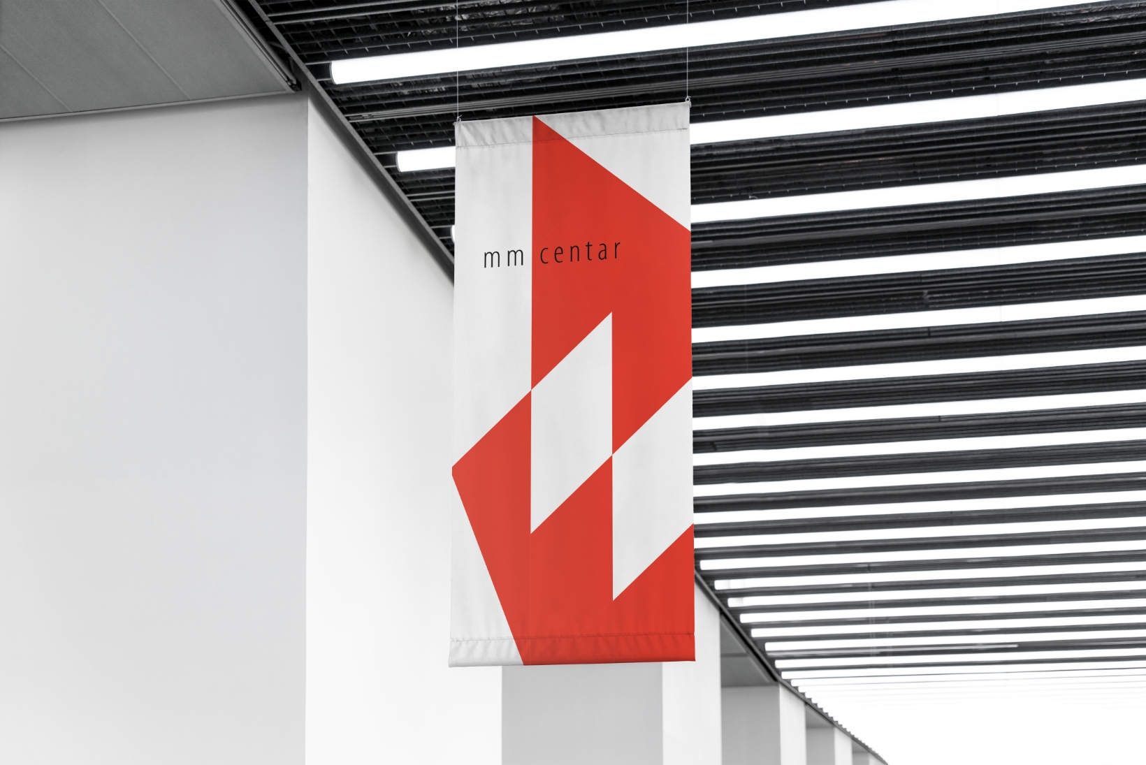
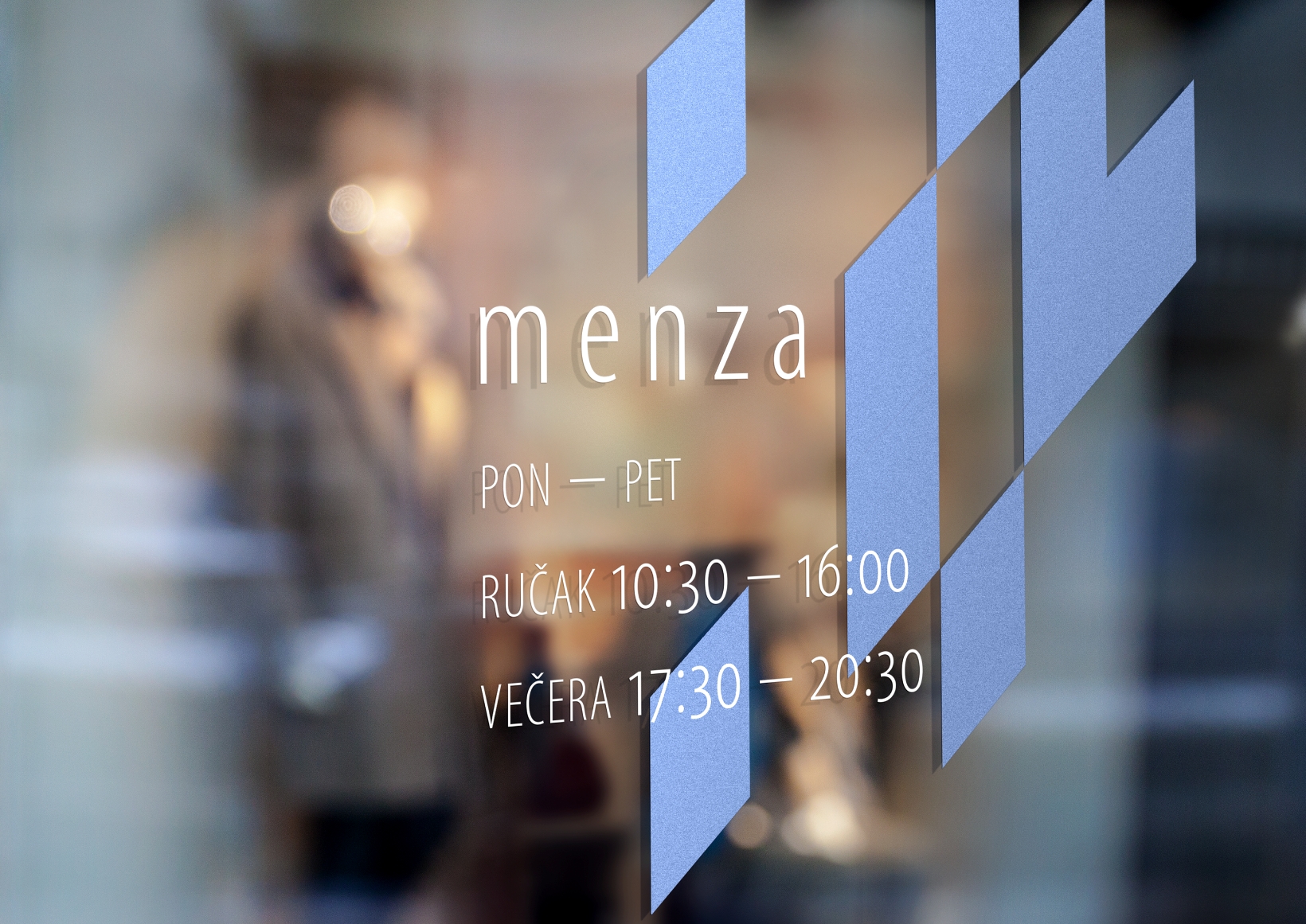
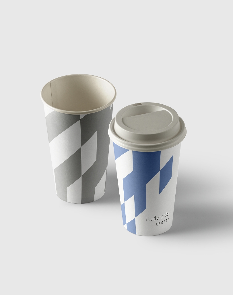
Each institution within the complex was represented by a distinct colour and variation of form, ensuring individuality within a unified system.
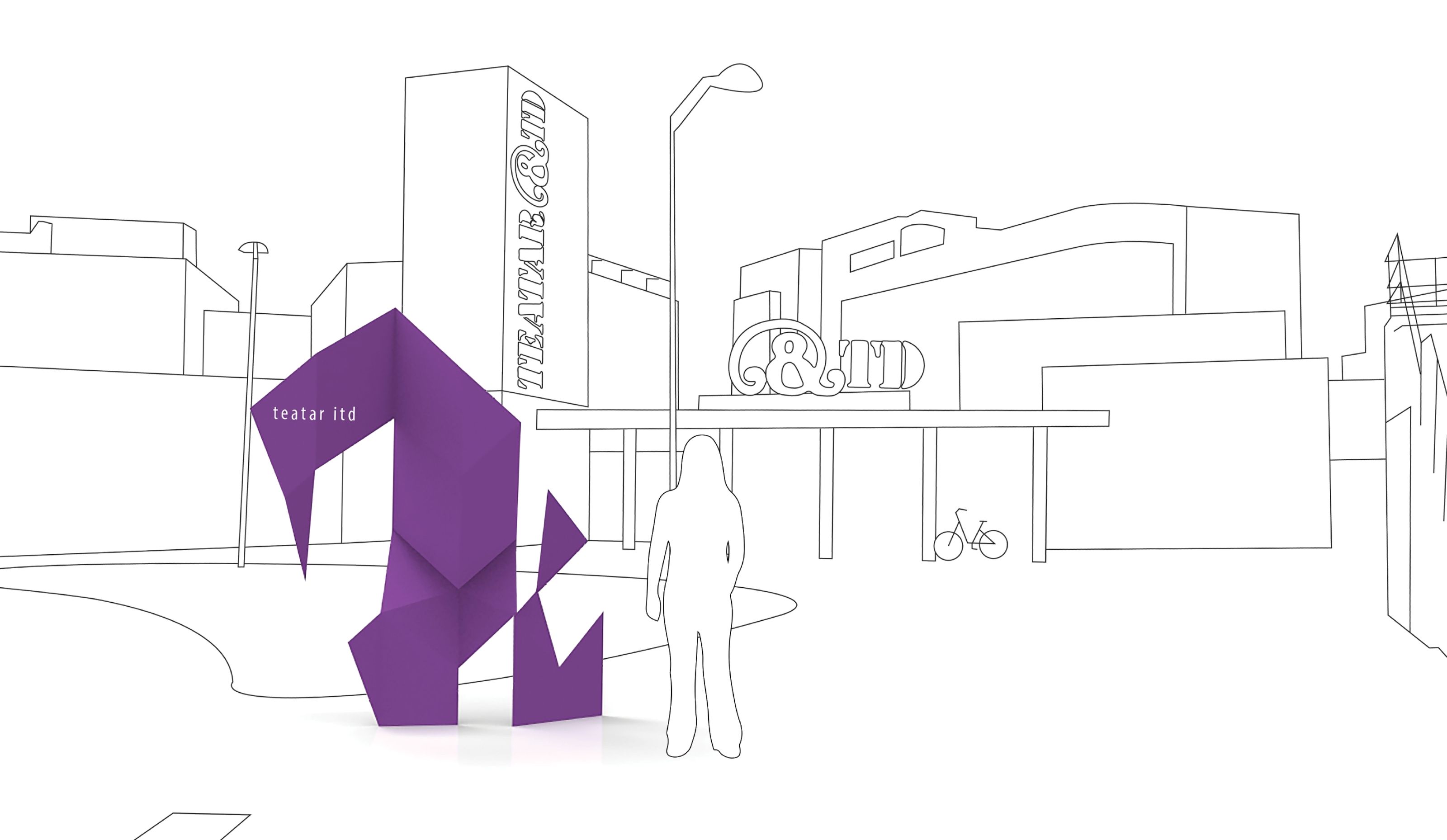
The 2D design language was extended into 3D physical signage, integrating branding and wayfinding.
The three levels of signage were defined following Marc Bulhardt’s principles of wayfinding: orientation, route decision, and destination recognition.


Obstacles
Balancing abstraction with usability was a key challenge. The design had to remain minimal and conceptual, fitting the Centre’s cultural context, yet immediately functional for daily use.
Another obstacle was the wide range of architectural styles and surfaces across the campus, which required adaptable materials and scalable visual elements.
The project demonstrates how design can translate spatial logic into visual form — turning physical movement across a campus into a narrative of colour, shape, and clarity.

Solution
The outcome is a dynamic and adaptable design system that visually unites the Centre while preserving each institution’s individuality.
01 Large exterior signs mark entrances and display site maps, anchoring the user spatially.
02 Interior wall signs guide movement with clear typographic hierarchy and directional arrows.
03 Branded support elements confirm location and identity, reinforcing user confidence.
The integration of colour, form, and placement creates intuitive clustering of information and a consistent experience throughout the site.

Results
The final system delivers clarity, cohesion, and character. Students can navigate intuitively using recognisable colours and forms, while the visual identity elevates the Centre’s image as a forward-looking cultural and educational landmark.
The outcome bridges design, architecture, and everyday functionality embodying the spirit of the student community it serves.